The truth is, most medical practice websites fail not because physicians don’t care, but because they were built without a clear strategy for patient experience. A strong website builds trust, communicates value, and makes it easy for patients to take action.

Your website is often the first impression patients get of your practice. In today’s digital-first world, it is also the place where many patients decide whether or not to trust you with their care. If your website feels outdated, confusing, or impersonal, chances are it will be the last interaction patients have with your practice before they click away.
The truth is, most medical practice websites fail not because physicians don’t care, but because they were built without a clear strategy for patient experience. A strong website does more than look nice. It builds trust, communicates value, and makes it easy for patients to take action.
Here are the most common reasons practice websites underperform, and what you can do to build one that actually grows your practice.
1. The Design Looks Outdated or Unprofessional
First impressions matter. A dated site tells patients, “We don’t invest in our image.” In competitive markets, especially urban areas, that can be a red flag. Patients expect your digital presence to reflect the same level of care and professionalism they will receive in person.
Fix it: Invest in a modern, mobile-friendly design with clean visuals, a clear logo, and consistent branding. Professional photography of your office, team, and patient interactions can go a long way toward showing warmth and credibility. A polished look makes patients feel confident in choosing you.
2. It’s Hard to Navigate
If patients cannot quickly find your services, accepted insurance plans, or contact details, they will not stick around. Frustration online leads directly to lost opportunities in real life.
Fix it: Keep navigation simple and intuitive. Use a clean navigation bar, a homepage that highlights what patients are most likely looking for, and service pages that are easy to scan. Clarity always wins over cleverness. Patients should feel guided, not lost.
3. No Clear Calls-to-Action (CTAs)
Even if your website looks professional, it will not perform if patients do not know what to do next. Do you want them to call, schedule online, or download patient forms? If it is not obvious, most will leave without acting.
Fix it: Place prominent calls-to-action throughout your site. Buttons like “Request an Appointment,” “Call Now,” or “Log In to Patient Portal” should be highly visible and repeated on every page. Think of your CTAs as invitations to take the next step.
4. It Doesn’t Work on Mobile Devices
More than 60 percent of healthcare website traffic comes from mobile. If your site scrolls awkwardly, breaks, or loads too slowly on a phone, you risk losing patients before they even see your services.
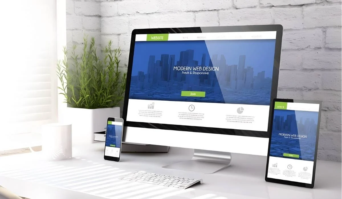
Fix it: Use a responsive design so your site adapts to any device. Test your site on multiple phones and tablets, not just desktop. Optimize images and keep your code clean to improve loading speeds. Patients should be able to reach you easily, whether they are on the go or at home.
5. There’s No SEO Strategy
Even the best-looking website is useless if no one can find it. Search engine optimization (SEO) ensures your practice shows up when patients are searching for care in your area.
Fix it:
- Use location-based keywords such as “family medicine in Tampa” or “pediatrician in Irvine”
- Write unique meta titles and descriptions for each page
- Create service-specific pages that answer common patient questions
SEO is not about tricking search engines. It is about helping patients find you when they need you most.

6. The Content Is Vague, Generic, or Missing
Patients visit your site because they want answers. Who are you? What do you do? Why should they trust you? If your website feels generic or fails to provide this information, they will move on to another practice that does.
Fix it: Use authentic content that reflects your practice’s values. Write clear bios for providers that highlight credentials and compassionate care. Create detailed service pages that explain what you offer in plain language. Add patient testimonials or success stories when possible. Real, relatable content makes patients feel connected.
7. There’s No Way to Convert Visitors Into Patients
Your website should not be just an online brochure. It should be an active conversion tool that helps turn interested visitors into actual patients.
Fix it:
- Add online scheduling or a lead capture form
- Make sure contact forms route directly to your staff for timely follow-up
- Consider HIPAA-compliant chat or messaging tools for quick questions
Too many practice websites fail because they overlook patient trust and usability. Learn how to design a site that reflects your care, supports SEO, and grows your practice. – Sunil Modi
Done Right, Your Website Becomes a Growth Engine
When your website combines smart design, patient-focused content, and seamless functionality, it stops being a static brochure and starts becoming a growth engine. It attracts the right patients, builds trust before they ever walk in, and makes it easy for them to connect with you.
At Practice Ascend, we design medical websites that do more than look good. We build sites that inspire confidence, reflect your brand, and integrate tools that actually grow your practice. From branding to scheduling to patient engagement, we make sure your website works as hard as you do.